

Overview
The Opportunity

Penguin Random House was looking to help their author, Haylie Pomroy, reach an increasingly digital market with her #1 New York Times bestseller, The Fast Metabolism Diet. To better serve this audience there needed to be a way to get the books information into their hands whenever and wherever they needed it. An app was the perfect solution to help Haylie’s followers at scale.
The Hurdle
One of the biggest reasons people fail at diets is because it is too much change, too fast. Managing a new diet is hard enough, but when people have to choose between that and managing their busy lives, the diet often falls to the wayside. Which left us thinking, how can we best use technology to help users manage all that complexity in a way that wasn’t overwhelming?
The Solution
We designed an experience that broke down the diet plan into a set of user friendly tools that encouraged daily use. Since users of this app would vary significantly between weight loss goals, dietary needs, and physical capabilities, the tools would have to be flexible as they guided people through the following tasks:
Menu creation
Grocery shopping
Meal planning
Tracking intake
Exercise planning
This resulted in an app that reduced the diet’s complexity down to manageable chunks and provided a gradual path towards users goals.
Details
Business Impact: Top 10 in iTunes App Store, #1 app in Health & Fitness category, one of Fast Metabolism's most successful paid apps for PRH
Project Length: 4 Months
Design Team: Creative Director Adam Michel, UX Lead Chris Hannon, Visual Designer Amber Manuguid, Developer Ben Roberts
My Contributions: Concept development, Presenting UX work to client, User experience development, Wireframing & flows, Creative oversight for visual design

“We took something very complex and broke it down into manageable chunks. The book could change how you thought about food, but the app could help you enact that change.”
White Board Sessions
Early white board sessions helped create a baseline set of features for MVP as well as help prioritize the design challenges as they related to the content and needs of the user.


Early Sketches
Early flow sketches and conversations between Adam Michel, Amber Manuguid, and me


Early sketches helped the team externalize UX concepts

Pivot Point
When creating the Shopping List portion of the app, we were faced with how to communicate how much of an ingredient you needed to buy in order to make you planned meals. This is tricky because a recipe’s ingredient quantities don’t follow a manufacturers packing sizes. We had to make a choice between giving users the precise total amount of something they might need (12 Tbs. of cumin), or the relative amount (3 portions of cumin). After much back and forth, it was decided to not make users do extra math at the grocery story and go with portion sizes.
Planning, Tracking, Flexibility
The core UX solution needed to achieve 3 key goals- breaking the diets complexity down so that it was manageable, allow users to track their progress, and encourage users to “stick to the plan” even if the didn’t always stick to the plan.
The core user experience needed to achieve 3 goals:
Break down the diets complexity into manageable chunks
Allow users to track their progress against their food, water, and exercise requirements
Encourage users to “stick to the plan” even if the don’t always stick to the plan.

Planning
To achieve the first goal of breaking the diet plan down, we prioritized the experience around a “My Day” home screen that took 30 days worth of diet plans and broke them down to a daily experience that took the guesswork out what the user needed to accomplish that day
Tracking
By adding a simple “tap to track” interaction to the daily requirements, users could easily track their progress with little effort.
Flexibility
To achieve the last goal, “My Day” has one small but important feature, the “Unplanned Item” button. This small addition lets people track extra items they may have eaten or extra activities they may have performed. This encourages people to stick to the plan because it prioritizes tracking the users reality as more important than the diet plan itself. The goal was to make users feel like it’s ok to bend the rules as long as you track it, which keeps users more inclined to come back to the diet even if they stray off path.

User flow for the app’s core experience, with “My Day” as the centerpiece.


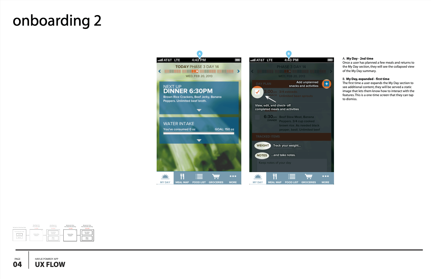
“My Day” core solution UX annotation


Mapping meals in advance allows information deployment throughout the week.


Visual Design
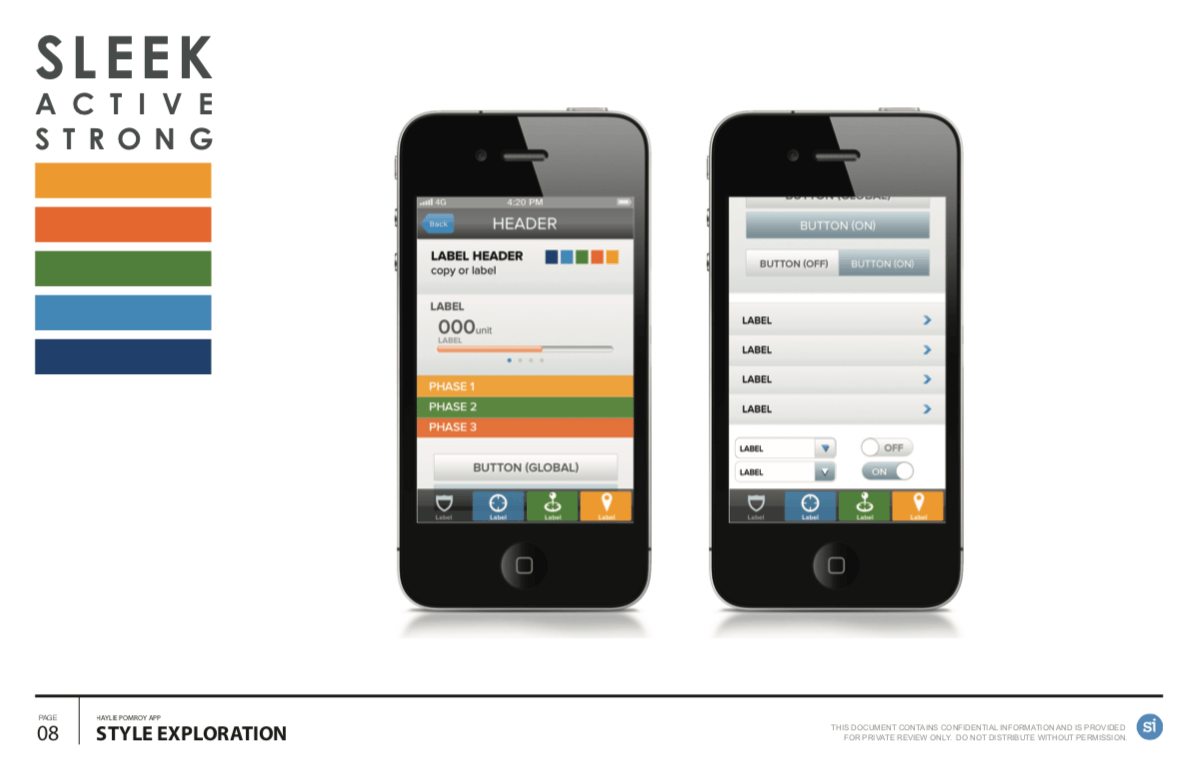
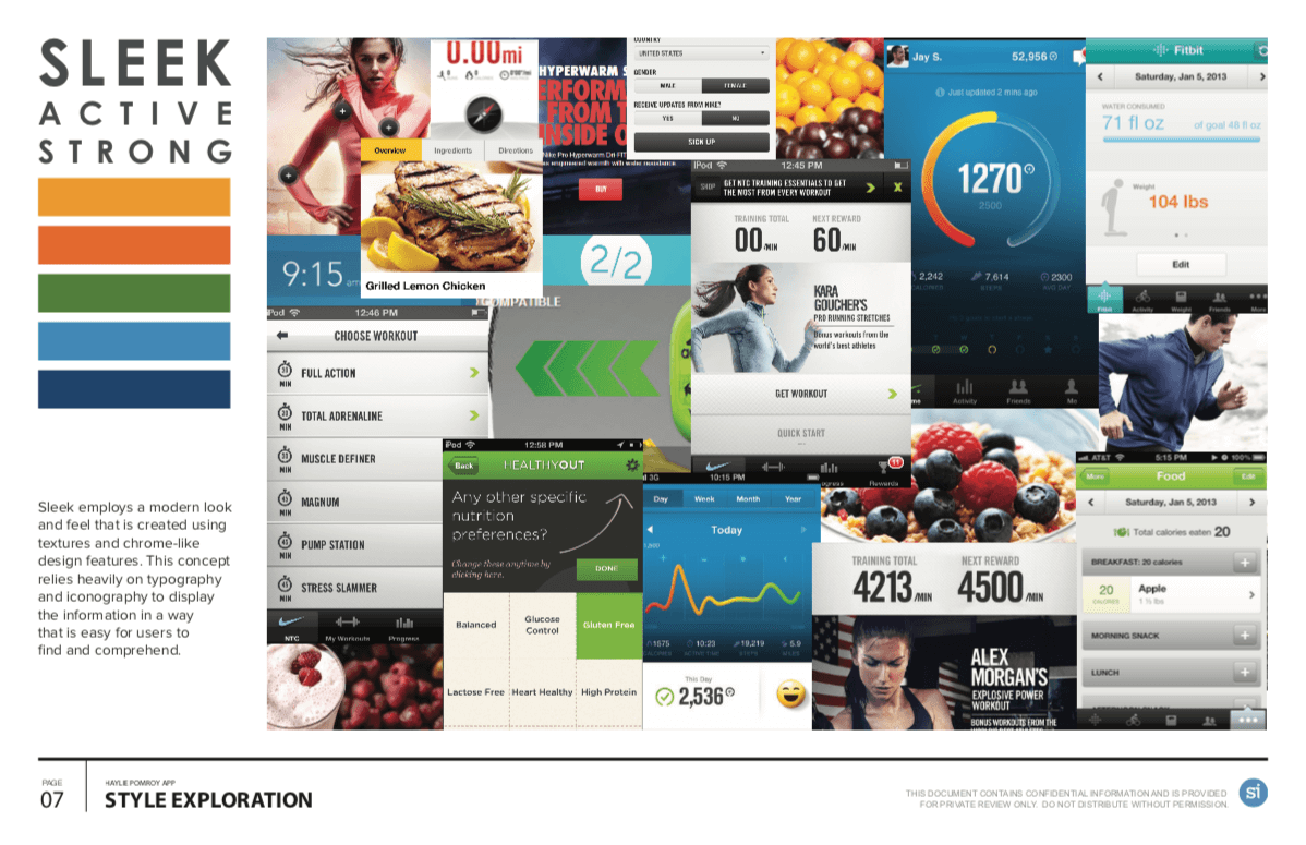
Mood Board Exploration
Visual design occurred in parallel to UX design, providing multiple design directions for the client to choose from. Visual design was lead by Amber Manuguid, with oversight by me.


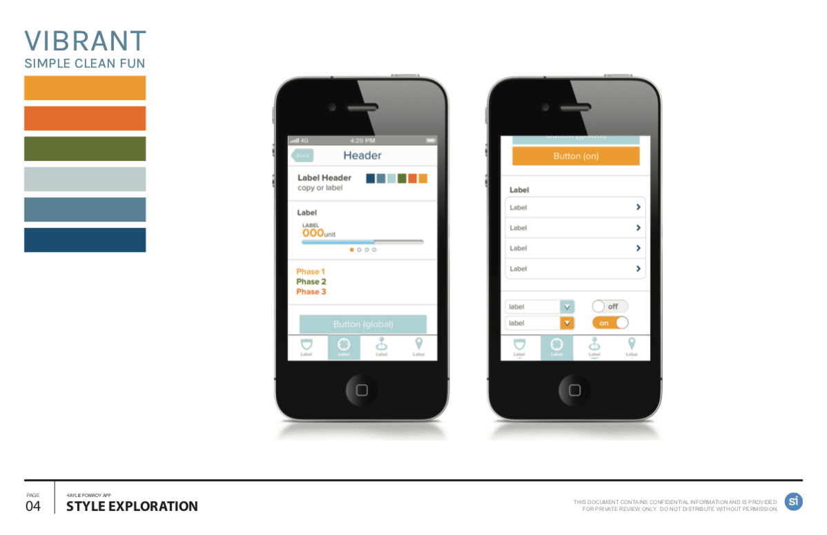

Final Designs
The “Vibrant” design directions resonated well with the team and the client and wound up being the selected visual direction.
Design by Amber Manuguid


What I would do differently
This app was created at a point where clients were less inclined to pay for additional maintenance and UX refinement after launch, as “iterative design” as part of a business plan was less understood. While the app launched well and had great features for the time, it rapidly gained (appropriate) criticism and poor ratings as features and bugs weren’t upgraded or corrected. In an ideal world, this would have been handled differently at the SOW level.