

Overview
Zonar, a leading enterprise fleet management company, faced a major challenge: its products and services needed architectural and experience-layer updates to unify them into a single, competitive platform.
Years of technical debt and design neglect had left the system fragile, and the user experience for Zonar’s customer-facing portal, Ground Traffic Control (GTC), was outdated compared to newer competitors. Frustrated customers struggled with clunky tools, often resorting to exporting raw data and building their own spreadsheets just to extract meaningful insights about their fleets. On top of that, Zonar serves a diverse range of customers across multiple industries—freight, vocational, and passenger transport—each with unique needs. The big question: how can we create a balanced user experience that works for all of them?
To truly serve its users, Zonar needed a smarter approach—one that delivered data-driven insights in a way that helped customers quickly understand what part of their fleet needed attention.
My Contributions: Design Leadership, DesignOps, Cross Functional Collaboration, Facilitated Workshops, Product Vision, UX & Visual Design

Project Length: 3 years
Design Team: ~9 people - Amanda Parkhurst, Rich Robinson, Kat Craig, Kayla Heard-Rising, Sean O’Brien, Katy Harrison, Troy Yung, Patty Namsapanan
My Role: Head of Design
* This is a very complex case study and to simplify your review of this, I have minimized most of the copy so it is effectively just “scannable” to get a sense of scope, complexity, and activities. For any given activity, what is not shown, is that it is multiplied across multiple products, reports, and services within the new platform. Basically multiply everything by 8-10 and you will get a sense of the scale.
“How can we transform our current platform’s offerings so they are competitive against emerging market entrants?”
Audit & Audience
Current experience audit
To begin, the UX team performed a cursory audit of the in-market experience. Some of the team (including myself) were newer to the company and still learning the breadth and depth of the legacy platform and what it had to offer. We discovered that it was an organically grown set of services and products that had been spun up over nearly two decades. As a result, much of the interface, UX patterns, and navigation schema was inconsistent and challenging to use.


Results
The audit revealed several usability issues, including a lack of clear instructions, an unclear step order, and inconsistent prompting, making navigation difficult. Additionally, while data is available after running a report, there is no sensemaking UI to help interpret it. Users must export the data into Power BI or Excel for further analysis, adding extra steps and complexity to the process. Overall, the experience is unintuitive and cumbersome.
“How might we empower users to easily get actionable insights from our data?”
Mapping Goals, Needs, and Pain Points to Archetypes and identifying “Jobs to be Done”
Each product and service within the in-market experience had an understanding of their user’s goals, needs and pain points. Those needed to be mapped to roles of users, like Fleet Manager or Mechanic, then from there we extracted the “Jobs to be done” by those roles.

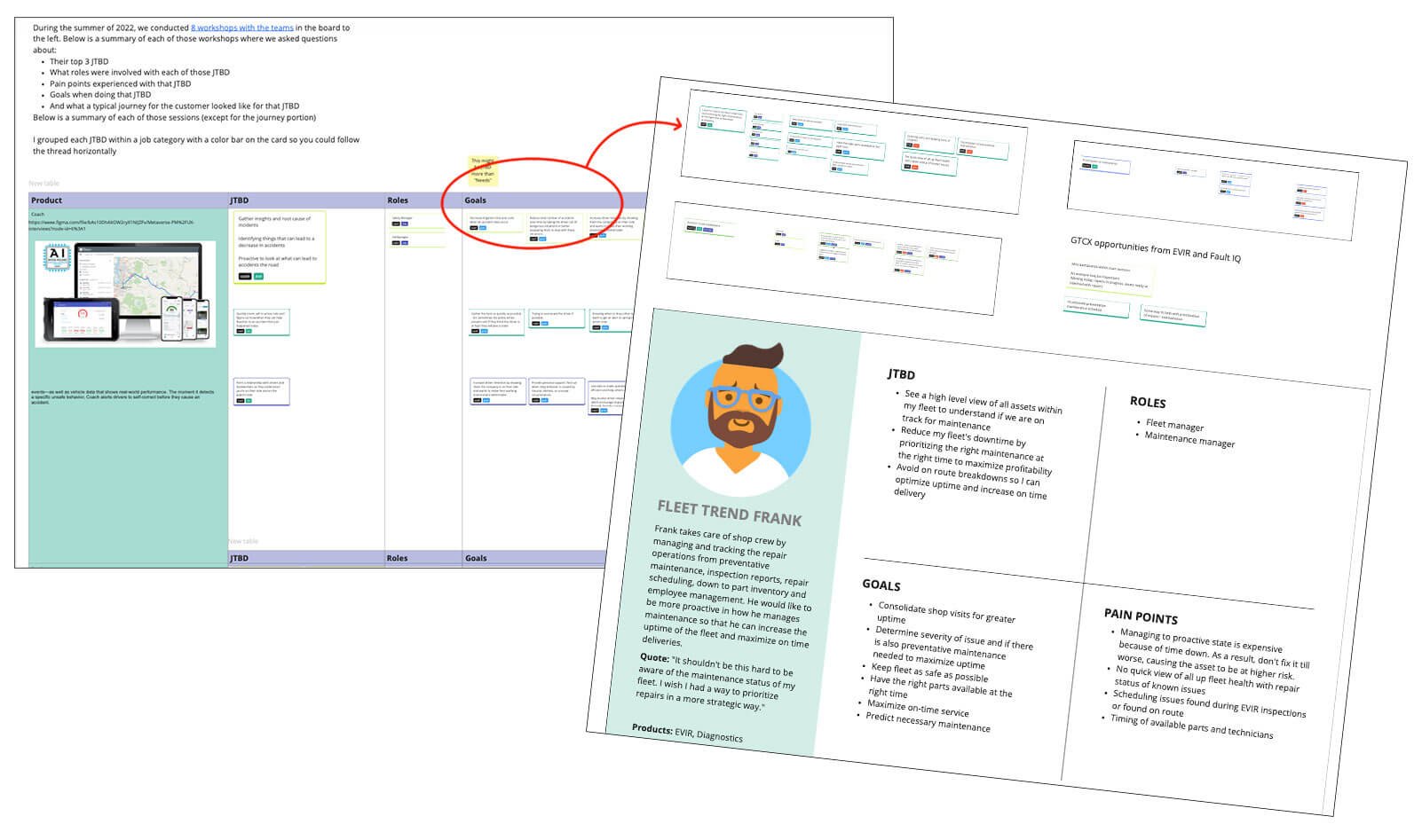

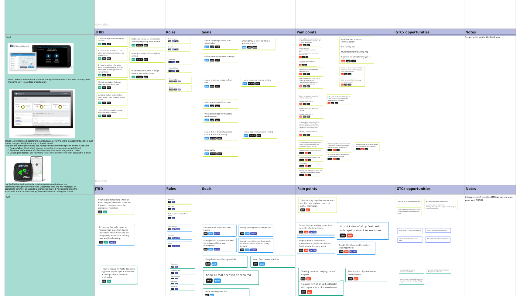

A Jobs-To-Be-Done Framework
After digging into goals, needs, and pain points for customers, a pattern emerged. Customers found it difficult to get what they needed from reports because they had to go to multiple places to get snippets of information, then compile them in one place externally to get insights from the data. As a result, we need to look at the experience layer and ask ourselves how might we curate types of data so users could perform a task (a “job to be done”) specific to their role and then organize work flows around those groupings.


Competitive Landscape
We faced strong competition in the market and needed to analyze how rivals were addressing customer needs with their hardware and software solutions. To gain insights, we collaborated with our marketing and sales teams, who had already researched key competitors, including Samsara, PeopleNet, Omnitrac, Synovia, GeoTab, Fleetmatics, Networkfleet, UbicaBus, Seon, Teletrac, and VersaTrans. This research guided our decisions on information architecture and taxonomy. Ultimately, we discovered that competitors focused on experience-layer solutions that helped users extract actionable insights from data.


Pivot Point: Data
In our legacy in-market experience, metrics like “speed” and “miles driven” were calculated differently across reports. This inconsistency made it difficult for customers to trust Zonar’s reporting. For the new platform, we needed to standardize calculations across all reports. However, different report types have varying data demands, making it challenging to use a single calculation method universally. Even the best choices could still cause inconsistencies and errors under certain conditions. Therefore, it was decided that consistency, even if occasionally incorrect, is better for the user.
Early Vision
Sketch workshops with leadership
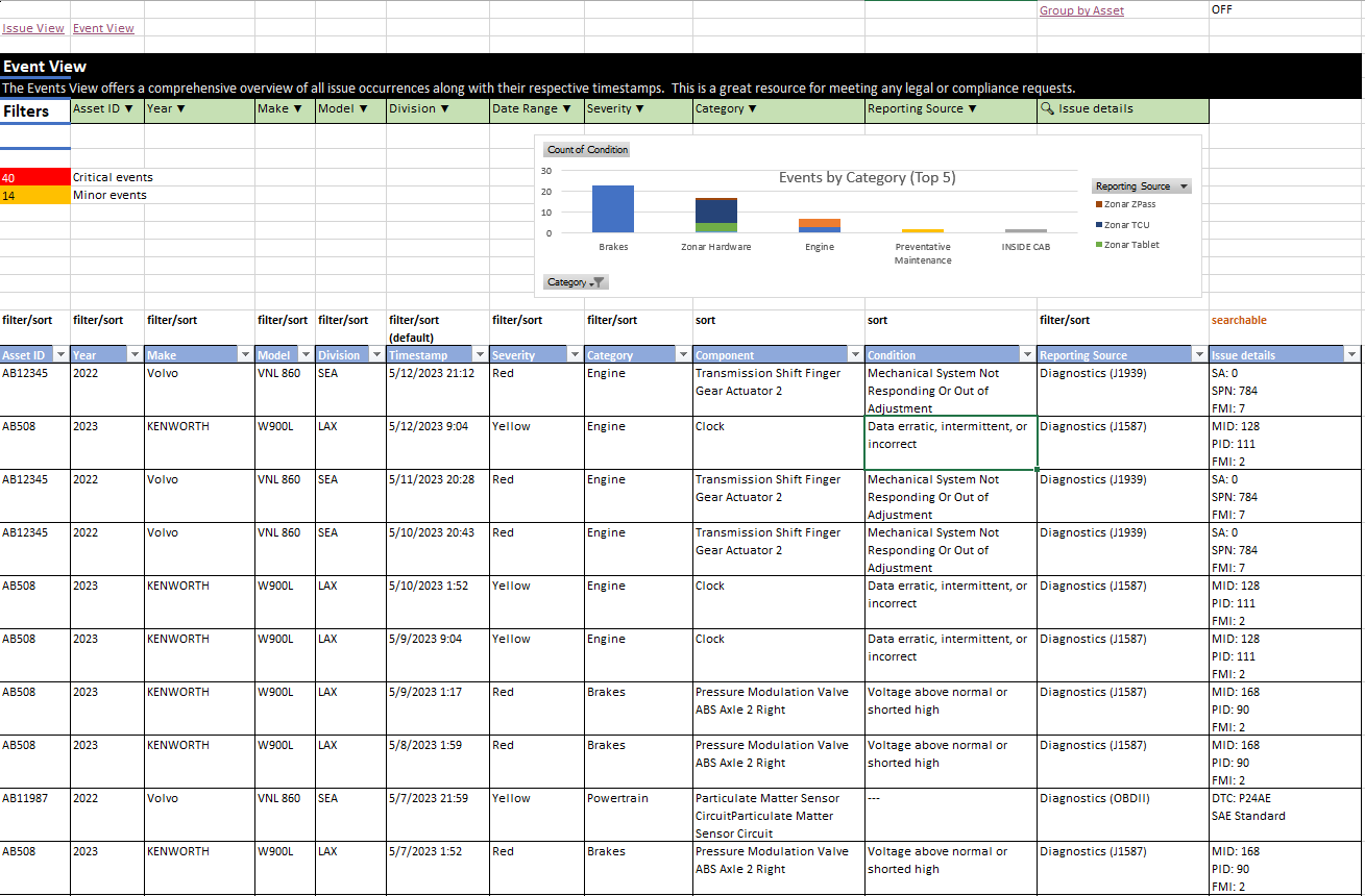
A major challenge was achieving true alignment among internal stakeholders, as discussions often lacked visual aids, leading to misunderstanding. To address this, design leadership facilitated collaborative sessions using Miro to illustrate ideas and bridge communication gaps. As a result, stakeholders agreed on a key UX concept gleaned from the competitive research—integrating data visualization into tabular data (absent in the legacy experience) to enhance user insights—paving the way for validation and testing.


Strategy
A strategy emerges
After initial sketches were worked up, designers took to comping up some higher fidelity concepts to walk the company through to see how the problem framing and potential solutions were coming together for a company all hands.


PRDs & Story Maps
Product Requirements Document
Based on jobs-to-be-done insights, the in-market Diagnostics report was selected for reorganization and enhancement with a new experience layer. Renamed "Maintenance Overview," it was designed to meet the needs of the "Markus the Mechanic" archetype. To support this, PMs and UX collaborated on a baseline PRD. With strong data skills, the PM (Carl Cutler) created Excel mockups to refine discussions with UX and engineering. This established a basic approach to creating requirements across subsequent reports.


Story Mapping all new reports for the modernization effort
To further align cross functional teams around the idea of a what a “Jobs to be Done” Maintenance Overview report might be, the UX team and PM had a Story Mapping session with engineering to align on the scope of an MVP. This allowed for deeper and more granular conversations regarding what kind of data and architecture it would take to support the emerging user experience and product requirements.
Research, Prototypes & Testing
Validating POCs with customers and collecting data in Dovetail
As designers explored how in-market experiences could translate to the new platform, testing became crucial to ensure the new concepts delivered value. We employed various methods, including moderated usability tests, desirability questions, and unmoderated surveys and card sorts. Results confirmed that our JTBD-based data groupings and added data visualizations improved user ability to locate information and extract insights efficiently.


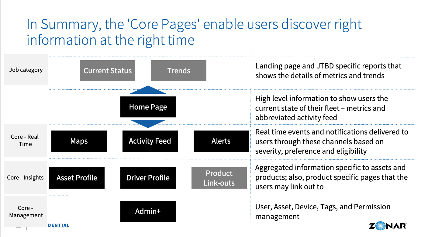
Information Architecture
Work Session
A significant challenge was rethinking the information architecture. The in-market experience had grown organically over 15 years and had nearly 130 items in it, many of them repetitious. To streamline it, we worked closely with Bobby Smith and Richa Verma to map the content to a JTBD framework and consolidated it.
Product Managers led working sessions to categorize use cases across in-market, in-production, new product, and unmet market needs. UX then collaborated with them to align the remaining reports with the newly defined categories.
Sorting use cases via Miro board
Working sessions to sort in-market offerings in to new IA structure
Visualization of use cases and in-market offerings
Design System
A scalable cross platform solution from a Material & Angular base
With the modernization effort underway, the design team needed to create a cohesive and consistent design library. Previously, Zonar operated in siloed pods, preventing a unified design approach and resulting in fragmented reports, UI, and overall experience. However, as engineering transitioned to a more unified structure, the design team scaled up DesignOps to develop a design system that all developers could adopt, ensuring consistency across the new platform.

Design system based on Material

Complex components using Auto Layout like nesting data tables
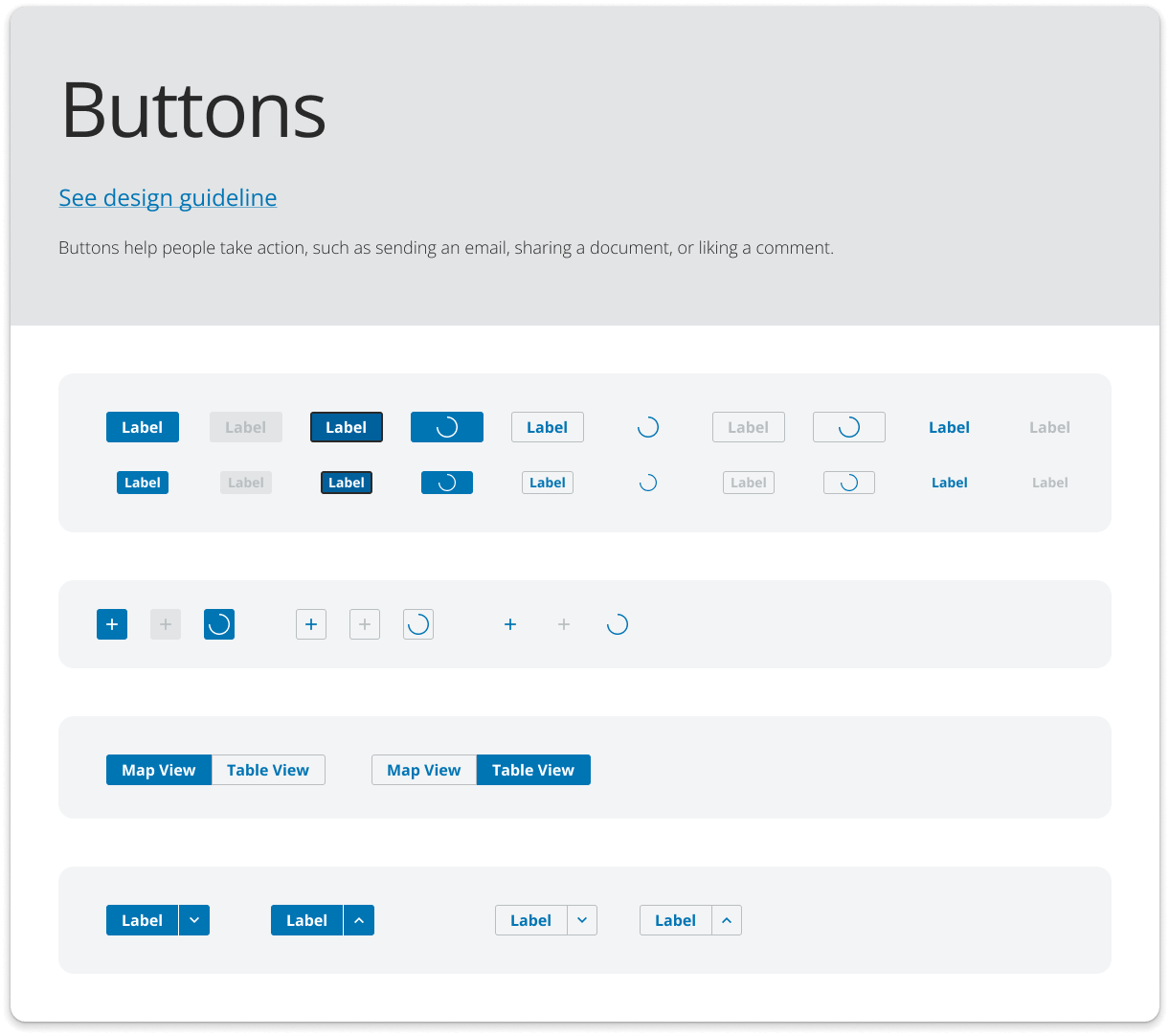
Documentation and states in Figma (looking to get to a Storybook-like home…)

More custom components…
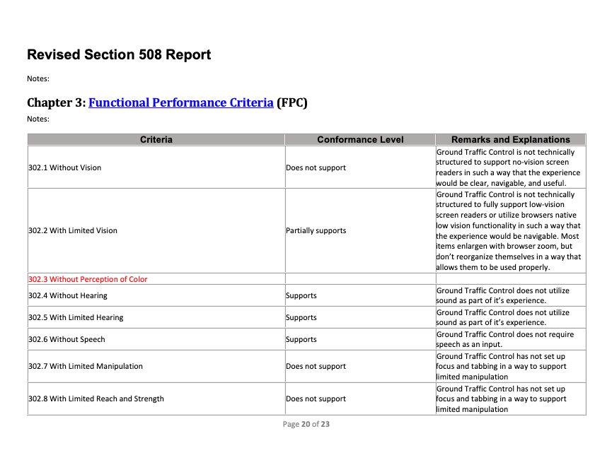
Accessibility
To prioritize accessibility from the start, the team used various tools to create a WCAG 2.1 AA-compliant design library, ensuring minimum font sizes, proper color contrast for text and data visuals, and clear page hierarchy for screen readers. We also conducted VPAT evaluations on the in-market experience to assess compliance and product status. Collaborating with engineering, we integrated these design principles into front-end requirements, performing periodic WAVE Chrome extension checks on production pages.
Tooling
Figma accessibility tools
WAVE Chrome Extension
ARIA Labels
Logical groupings / regions
VPAT
Artifacts


Figma
Comping new designs in Figma
Figma is our primary design tool, enabling collaboration with devs and PMs through reviews, UX documentation, Design Library resources, comments, and Dev Mode.
However, we learned that Figma should only serve as a source of truth for UX patterns and UI components—not for dummy data or content, which led to errors when mistaken as final. Additionally, PMs expected retroactive updates to old Figma comps, which was impractical. As result, we had to manage expectations and establish where sources of truth lived for such a large effort.


Testing
Testing usability of new concepts in Maze
As more complex user flows, particularly for site admin functions emerged, we utilized Maze for unmoderated testing to validate UX patterns.


Product Vision
A strong product vision to rally around
Long build time required frequent “vision work” to be generated and evangelized to the broader org so they could get a sense of where we were headed. Amanda Parkhurst, Sean O’Brien, and myself generated the vision work in the videos below, and I presented them to the product delivery org.
Migration
Migration plan for users between legacy and new platform
Customers wouldn’t all migrate over at once, as build time was lengthy. As a result, we needed to forecast what value was necessary to hit a critical tipping point to entice users to come over to the new experience.


Final Designs
New platform MVP roll out
Several new reports have been successfully launched and we continue to iterate on features and functionality to improve value for users.
Write a good SEO description here


Data Driven Design
As we launched the reports, we closely monitored usage data to assess adoption rates and identify barriers. Noticing some users splitting time between platforms, we investigated the cause and focused on incremental improvements to address key pain points.
