Overview
Zonar, a leading enterprise fleet management company, faced a significant challenge: its products and services required architectural and experience-layer enhancements to unify them into a single, competitive platform.
To support this initiative, the design team needed to establish a cohesive and consistent Design System that could be leveraged across multiple development teams. When I joined Zonar in 2022, the foundational elements of this system were already in progress, led by Daniel Singer and Rich Robinson. Using Google’s Material Design as a foundation, the team defined core design elements—including color, typography, effects, and grid systems.
They laid the groundwork for what would become the Design System, developing design principles, core design elements, initial components, and documentation standards. Their vision was to create a comprehensive, code-based system housed in a repository like Storybook. However, due to limited support from senior leadership and a lack of engineering resources, we had to pivot our approach.
In response, I shifted the teams focus toward what we could control—expanding and refining our design library in Figma to work seamlessly alongside engineering’s pattern library. This allowed us to maintain consistency and scalability across teams despite the constraints.
My Contributions: Adapted strategy following leadership changes, Designed and refined core Figma components, Collaborated with engineering on consistent Pattern Library usage and Design QA process for components
See my DesignOps case study to better understand how we operationalized the building of this system.

Project Length: 3 years
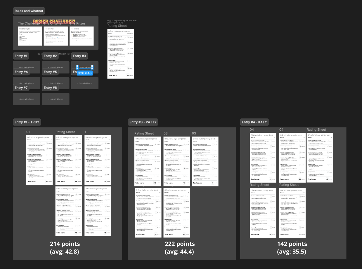
Design Team: ~8 people - Daniel Singer, Rich Robinson, Sean O’Brien, Katy Harrison, Troy Yung, Patty Namsapanan
My Role: Head of Design
“How might we ensure a consistent user experience for our customers?”
A bad report card…
Shortly after I arrived at Zonar, Rich Robinson performed an audit of the Design System. This was the basis for how we focused our efforts moving forward:

Principles & Best Practices
Principles
Global principles for the design system….


Filtered at project level…..


Core Design Elements
Color Palette, Type Ramp, Icons

Atomic Design
Molecules

Organisms

Templates
Figma
Figma


Branches, Booleans, & Variants


Pattern Library
Engineering and the “PL”
A challenge we ran into was that Zonar had decentralized engineering teams. As a result, teams weren’t always aligned with using the same pattern library or the same version of Angular. This made it difficult to tell if what we designed would actually make it to production, and if what was in production was actually corrected locally for Design QA or an actually correct component. Eventually, engineering started working on a centralized gallery for us to compare Figma components with the Pattern Library.

Documentation
Confluence
Extensive documentation was created in Confluence for reference for engineering.


Standards
Sources of truth
It became clear that UX needed to drive alignment across the organization in terms of UX writing, with an emphasis on measurements and nomenclature. Prior to this effort, different teams used different methods of labeling (and calculating!).


Driving Adoption
Breaking habits
Given that the design team went years without having to use consistent design resources, many designers had developed methods of working that didn’t always involve using the most up to date Figma components. We began using “Design Challenges” as pop-quizzes to drive adoption.